How to get started with poster design
I would like to share with you what I learned in the past 6 years as a print designer for Karpe Noktem. If you want to get started with designing posters, you need to adhere to some basic rules.
I presume that you have some notion of how Photoshop works. If you use different software, that’s no problem: Paint Shop Pro or GIMP will do as well, as long as you know some basics such as choosing the correct canvas sizes, the behaviour of layers, etc. What I want to emphasize is that you don’t have to be a photo manipulation wizard or artist prodigy to make a good poster. If you don’t know how how to do something, be sure to google it. You can find plenty tutorials online.
1. Start out with a proper poster template
This is the absolute minimum required for a good print design.
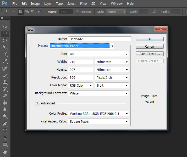
When you start a new file in Photoshop, select the proper canvas size (A4, A3, …) and set the document resolution to at least 300 dpi. This ensures the quality of the poster when you try to print it.
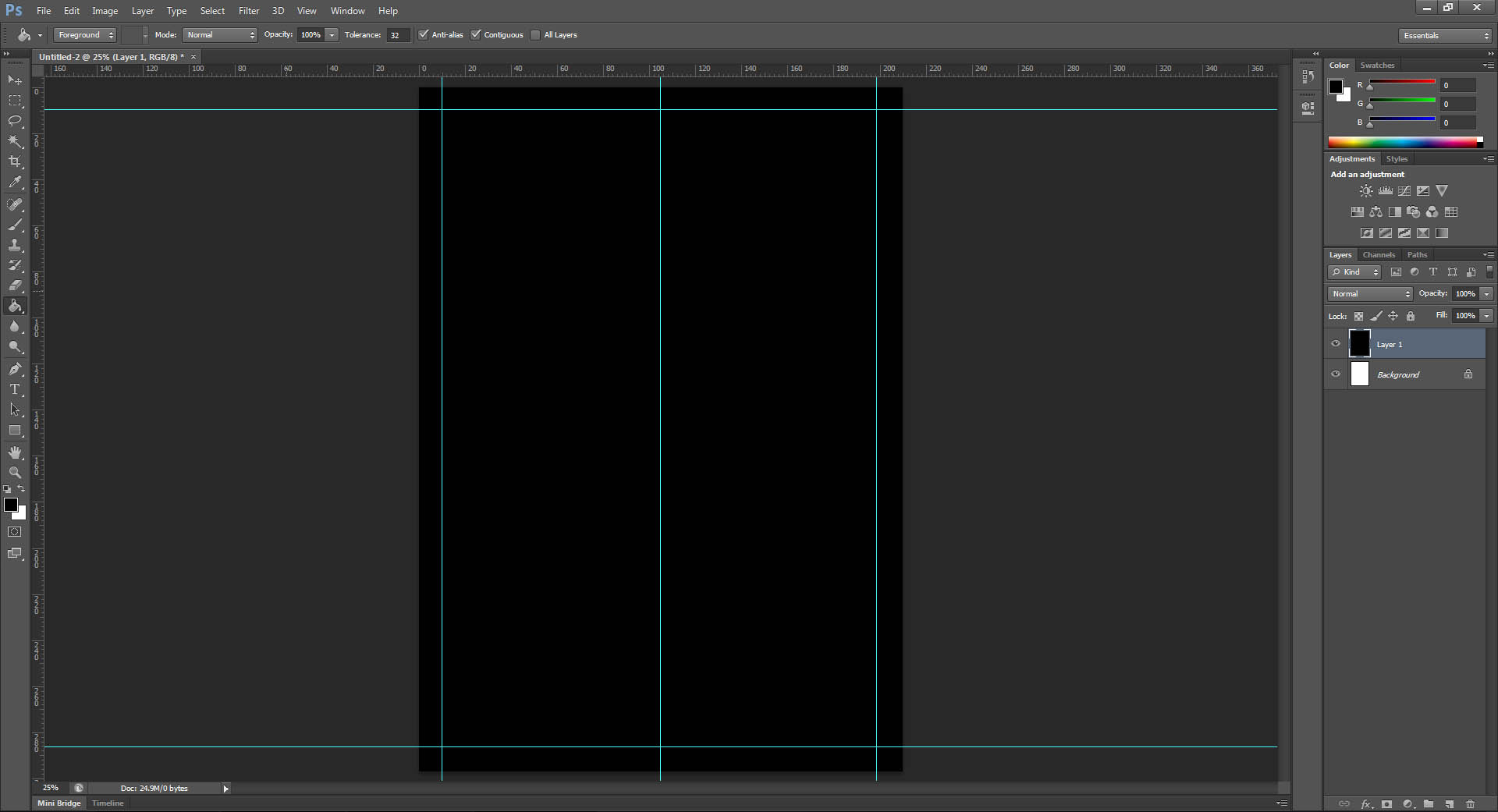
Use guides to mark the middle of the document — this makes aligning things easier. Also consider placing extra guides at least 1 cm from the borders of the document. This’ll keep you from putting important elements, such as text, too close to the document borders. Proper margins give your poster a more sophisticated look.
If you have to use some kind of branding template or adhere to a style guide, put all compulsory elements in place first. Think of colours, logo’s, etc. Then you have the ‘bare bones’ of the poster, and you can continue from there.
2. Think of the goal and audience of the poster
Your poster probably has to communicate some kind of message. For a band night, that would be information like the date of the venue, ticket price, the artists and the location. Keep this message in mind at all times. It will help you design a poster that both resonates with your intended audience and that communicates the message clearly.
3. Communicate your message clearly
Make sure your audience doesn’t have to search for the information they’re looking for and pay attention to readability. This means: don’t use ornamental fonts that no one can read and don’t use clashing colours for the background and text. Nobody likes reading red text on a green background.
4. Attract attention
The content of your poster should be a combination of clear text and eyecatching visuals. Choose graphics with care. Choose images, colours and fonts that speak to the particular audience of your poster. For example, look at this poster for ‘metal band night’:
Finally, use fonts wisely. Don’t try to put your entire font collection in one poster. Just stick with a maximum of 3 fonts. If you think you don’t have an appropriate font, check out the list with resources below. And please, PLEASE, don’t use comic sans — unless you need a poster for a children’s party.
4. Resources
- Dafont.com: free fonts
- Deviantart.com: for stock images and lots of inspiration
- StockExchange: for (non-free) stock images
- Colourlovers.com: colour palets
5. Tutorials and examples
- 32 brilliant poster designs in Photoshop
- 30 cool concert poster designs for print inspiration
- A showcase of poster tutorials in Photoshop
- 51 inspirational vintage movie posters
- 38 randomly awesome movie posters
- 16 sensational poster designs
If you have a question or even more tips for good poster design, let me know in the comments!


